Sunday, July 30, 2006
Friday, July 28, 2006
why cats rule the world
 The role of cats in our daily lives is clear: they function in a supervisory capacity. For example, when there is a family event, they act as MC, immediately taking centre stage.
  When there are creatures smaller and weaker than them in the household, they make sure that these small beings are protected from harm. Their vigilance is often around-the-clock.
When there are creatures larger and stronger than them in the household, they mete out discipline of the 'tough love' variety.
 They even supervise the children's education, ensuring that the all-important evening reading is strictly adhered to.
 And most people think cats are self-centred beings interested only in their own happiness!
Thursday, July 27, 2006
toys in the attic
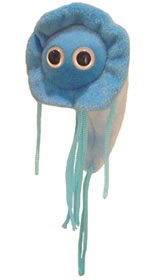 I've been so pedantic lately that I'm way overdue for a little fun, courtesy of the web browser of Rudy. And what's more fun than toys? You may think your kid (or you) has every stuffed bird or beast under the sun, but I bet he doesn't have a stuffed microbe! The descriptions are what kill me:
GIANT Microbes Plush Doll - Maladies Microbe Giardia (Giardia lamblia)
If you go down to the woods today, you're in for a big surprise -- if you drink contaminated water. Learn how to keep today from being the day you get Giardia.
What? You already have the stuffed Propionibacterium acnes, better know as a pimple? ("Give our little fellow a big squeeze, and you're sure to feel better!") If you don't think it can get any more disgusting than that, then you haven't met these siblings. 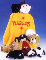
But ... if you happen to be Jewish and it's Passover, then you're the luckiest kid of all. Think of all the hours of fun you'll have with your Plagues Bag. It includes all 10 plagues! These are especially beloved because you'll now have a better chance of besting Emily McWasp and her decidedly un-kosher fluffy friends.
Sweet dreams.
Wednesday, July 26, 2006
the joy of feedback
 The comments on my last post were so good that I almost created a post of them alone so that they would get optimum exposure, but have decided to compromise. For full effects go here. By the way, I tracked down the original post that generated my philosophizing -- and therefore all the great feedback. It's here at Grow Wings.
Another recent comment, this time on the name of this blog, reminded me to post this photo of a pair of silver earrings a friend gave me years ago. One day last year, while putting them on, I realized that the pint-sized multi-layered philosophy expressed in those four words was exactly right for the title of this blog ... and promptly re-named it. (Forgive whoever made them for not knowing how to spell 'colour.' :)
Monday, July 24, 2006
a sow's ear
A week or so ago I read on an illustration blog (and I can’t for the life of me remember which one – credit, someone?) a comparison of fine art and illustration that was primarily in defense of illustration. It got me thinking (always a dangerous thing) about that age-old 'what is the purpose of art?' debate.
As a student at a university that had fine arts (visual arts) and art education departments I was aware of the tension between the two – i.e. many fine arts students had an arrogant air of superiority whereas art education majors were hefting around chips on their shoulders about their supposedly less serious role -- but as applied arts (illustration, graphic design, etc.) are usually the territory of technical/community colleges and polytechnics (at least in Canada and the UK as they are not normally considered academic fields) I didn’t realize that the same suspicion existed between illustration and fine art. After all, illustrators are working artists, unlike a lot of fine artists, and their craftsmanship, imagery and execution are often superior, so where’s the problem?
Apparently the problem lies in intent ... or at least understanding of intent. The popular view of avant garde art is that it’s a sow’s ear dressed up as a silk purse. And who wants to see a sow’s ear hanging on a gallery wall? Since illustrators are producing work for people and for a purpose, the idea of art for art’s sake may seem counterproductive and often downright pretentious to them. It’s easy to see the intent of illustration: illustrators work for a client on a project-by-project basis for a clearly-defined outcome. But why would anyone take photos of people’s feet in bathroom stalls, hang them in a gallery and call it Art (besides me)? You can’t hang it on your dining-room wall (at least, most people wouldn’t) and isn’t that what fine art is all about? Decoration? After all, illustration is all about print media. Isn’t it?
That’s where mainstream thinking falls down, but it’s not a place where most people go. It’s a lot easier to point a finger at Todd Janes ironing shirts on a downtown Edmonton street and say, “That’s art -- how? I could do that!” using dramatic abstract paintings in people’s houses and lovely pictures in children’s books as the measuring sticks. But this assumption of intent is flawed. Most people, including illustrators who feel they have something to prove (fortunately that’s not most of them), feel that it can’t be art according to the rules. But they’ve read the wrong rules.
Art, meaning cutting-edge, avant garde, performance and conceptual art (not the kind of painting I do) is not about producing something for the eye, like illustration, it’s about producing something for the brain. Some of it works and breaks open widely-held conceptions about not only art, but anything society holds as an unquestioned value. Some of it fails miserably. Same as any other form of fine art. The beauty is in the risk-taking: the courage to explore new territory and "go where no man has gone before." Where do you think art or illustration would be right now without the Impressionists, the Cubists, the Abstract Expressionists? They were the avant garde of their day. And like some applied artists of today saying "I don’t get it," once upon a time there were smug arseholes cooling their heels in their Paris printing shops, discussing the paintings at the Salon des Refuses and declaring, “It’s not pretty; it doesn’t have the same skill as the work of our lithographic artists. Those losers will be laughed out of town, especially those charlatans Cezanne and Manet.”
Then there was Picasso. Then there was Duchamp. And so on. That sow’s ear hanging on the wall may not be the work of the next Pollock, but both artists come from the same place of exploration and envelope-pushing. The intent is as different from illustration as apples are from oranges. Or silk purses from sow’s ears. The real question should be, which intent is more important? (Can of worms now open and available for sampling.)
Saturday, July 22, 2006
opposites

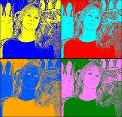
While visiting vfm4's Flickr page (one of my favourite web-stops) I discovered St's Flickr Warhol. Since I had nothing to post for Illustration Friday this week and hadn't gotten around to doing what I still may do for it, I thought this might be a good stop-gap. The original is here.
Thursday, July 20, 2006
socket
 Last Saturday I was painting in my studio and listening to CBC Radio 1 when a visual arts programme I'd never heard came on. It immediately appealed to my sense of humour as artists often take themselves way too seriously. As a closet cynic from an early age, I never made any lasting friendships at art school because the focus on developing an outre personality/image and the seriousness with which everything was analysed made me feel totally bogus as an artist. I was an outsider even amongst outsiders. (Don't tell my mother that her worst fears about me are all true.) But I was always glad that I could, at least, appreciate the flip side.
 And speaking of flip sides, artist Angela Antle produces and hosts the summer show Socket, a cheeky half hour of national radio devoted to visual artists. (And to prove just how small the visual arts 'press' is in Canada, she reads this blog.) My favourite profile was of Vancouver artist Jessica Bushey, who has spent years photographing feet, and
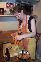 anything else that attracts her attention, in public washrooms. This week looks even better. I won't even tell you what this photo is all about; you'll have to listen for yourself. It's on Wednesdays and Saturdays, June 28th-Sept 2nd: Wednesdays at 11:30 am/12:00 Nfld and Saturdays right after the 4:00 pm news/4:30 Nfld. You don't need to be in Canada if you go here.
PS If you can stand another helping of me, visit Carla's Anonyrrie for more. She did a flawless job. (And if you can't -- me neither.)
Wednesday, July 19, 2006
teaching america to draw
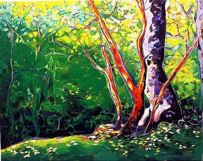
Saltspring Glade
The phrases "I wish I could draw," or "you're lucky to have artistic talent," sometimes give me pause. The understanding is that either you have it or you don't. The implication is that if you have it you're a freak of nature, albeit a lucky one. Granted, many people are born with a combination of genetic factors that predisposes them towards success in a particular skill area, but few people assume that the ability to play the violin beautifully or score a hat trick on the ice (I'm talking hockey) is based on the position of the stars at one's time of birth. You have to work, and work hard, to do well in any discipline, and desire is probably a greater determiner of success than any other single factor. The overnight success is a myth.
Once upon a time the ability to draw well was almost as valued as the ability to read and write well. Drawing was, for example, an important part of the training of a British army officer, and not just because cameras didn't yet exist. Currently showing at The Grolier Club in New York City is an exhibition entitled Teaching America to Draw. It examines the history of drawing as a valued discipline, throwing in some philosophy and modern comparisons. In his fascinating article in the New York Times, An Exhibition About Drawing Conjures a Time When Amateurs Roamed the Earth, Michael Kimmelman says, "We’re addicted to convenience today. Cellphone cameras are handy, but they’re also the equivalent of fast-food meals. Their ubiquity has multiplied our distance from drawing as a measure of self-worth and a practical tool."
Still ... I'd love to own a cellphone camera.
Check the comments for some interesting feedback.
Monday, July 17, 2006
edge...
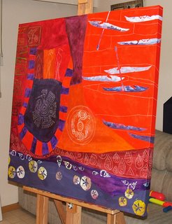 ...as in 'water's edge,' not 'edge of reason.' This one, at 36" x 36", is slightly smaller than the first three. I decided to take a couple of photos of this process as well, though it must be getting pretty old by now.
 The first image shows the underpainting, the stencilled images (sand dollars, seashells and kayaks), the stamped images (the wave blocks on the lefthand side) and the conte outlines for the images that still need to be painted by hand.
The water gun on the sofa is not part of the imagery.
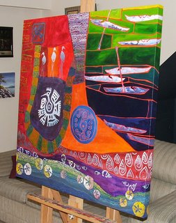 In the second photo I have painted in all the conte-ed images, added patterning (small waves and spirals) and started the background (around the kayaks).
 The water gun has been sent on a dangerous mission.
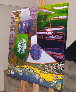
This may look finished, but I have yet to make a few minor changes, specifically in the coloured panels around the kayaks. Strangely enough, this series is getting harder and harder to paint. There's something about a new idea that can make the work just fly off the paintbrush, but I found the process far more laborious in the last two, repainting areas more often than I'm comfortable with and fretting over anything even slightly frettable.
The water gun has, by this time, gone to that great artillery store in the sky, having been bested in a tough fight, and abandoned to the back patio.

Sunday, July 16, 2006
the dinner party
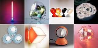 Before even setting the table, make sure you're worth showing up for, even if pressed for time. After the hired help have done their thing, it's important to then create an ambiance with the right lighting. Feeling ready for anything? Guests arriving? Time to mobilize the chef, waiter and entertainment and serve dinner. Just remember: the location can make or break your reputation. The skies of New Orleans during hurricane season (or Baghdad at any time) is a definite 'don't.'
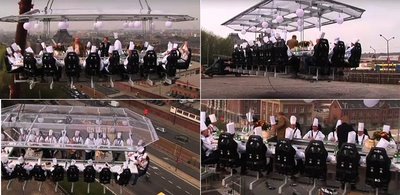
As the
 party starts to wind down and boredom starts setting in you're going to need something even more outrageously nouveau to keep the attention and therefore respect of your guests. Time to win friends and influence people with the newest, most mind-boggling idea yet: lo-tech entertainment.
Party's over and you still have to get up for work the next day, in spite of the hangover? Don't wash
 that dirty wine glass, extend the spirit of DIY and use it.
 The challenge now is to top this one the next time you have a few friends over for a meal.
Friday, July 14, 2006
abandoned farm buildings

This is a stone lithograph I did a long time ago of abandoned farm buildings in Saskatchewan. This week's Illustration Friday theme (Sacrifice) made me want to 'age' it further in Photoshop, particularly as the original copied image is such poor quality.
Wednesday, July 12, 2006
win a date with kyknoord

Blogging's most recently eligible bachelor is on the block. As he is my heart's desire -- but already has a harem of salivating slaves at his beck and call -- I've sent in mutiple entries, using various email addresses in an effort to deke him out. He may be cute but he's not too smart (I like that in a man). Meantime, I'm sharpening my tongue just in case those harpies take issue with me after I've dragged him back to my cave by his pony tail. I love blood sport.
there are two different kinds of genius in the world...
 In Daniel H. Pink's article What Kind of Genius Are You? he explains a new theory that suggests that creativity comes in two distinct types – quick and dramatic (the mercurial young genius or Conceptualist), or careful and quiet (the late bloomer or Experimentalist). In the article he explains the theory and gives examples from history:
Conceptualists
Many geniuses peak early, creating their masterwork at a tender age ...
LITERATURE: The Great Gatsby - F. Scott Fitzgerald - Age 29
PAINTING: Les Demoiselles d’Avignon - Pablo Picasso - Age 26
FILMMAKING: Citizen Kane - Orson Welles - Age 26
ARCHITECTURE: The Vietnam War Memorial - Maya Lin - Age 23
MUSIC: The Marriage of Figaro - Wolfgang Mozart - Age 30
Experimentalists
... while others bloom late, doing their best work after lifelong tinkering.
LITERATURE: Huckleberry Finn - Mark Twain - Age 50
PAINTING: Château Noir - Paul Cézanne - Age 64
FILMMAKING: Vertigo - Alfred Hitchcock - Age 59
ARCHITECTURE: Fallingwater - Frank Lloyd Wright - Age 70
MUSIC: Symphony No. 9 - Ludwig van Beethoven - Age 54
Those of us past our 'use by' date are hoping that if we run like hell we'll be able to see Cezanne and Beethoven on the horizon, if not actually catch up.
Tuesday, July 11, 2006
ruxton island
 Number two son and I boarded a ferry from the mainland last week to spend an idyllic weekend on Ruxton Island via Nanaimo. My very good friend, Sharon, has recently abandoned me to the local suburban hausfraus (I've taken to hiding in my basement) to take on a new job in the promised land, taking her husband and four little boys with her. The bitch. Adam is good friends with her eldest so we had to go and see for ourselves why they felt compelled to leave us behind.
One of the reasons is their
 ramshackle (but most charming) cabin above a small inlet on Ruxton Island, just a half hour's boat ride across from their new home on Vancouver Island. The location is amazing and there are hours of things for small boys to do there on the beach and in the woods. Adam was pretty peeved when it was time to leave.


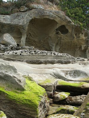 We discovered a nest of baby birds in the middle of a dead evergreen bush near the ground. Does anybody know what these babies are? Their parents have a very distinctive call, as evidenced by their scoldings as we inspected their private digs.
It was pretty hard to return to civilization. But at least I have these.

theblogreader.net
 There's a new blog review site in the blobosphere (oh man -- that's a typo I just have to keep) whose reviewers write very journal-worthy profiles of blogs they find interesting. I was fortunate to be tracked down by Kimberly Sherman who rang me up about 10 days ago to interview me. Take a look around and then check me out.
Great Blogs by Crafters Toplist is the recent brainchild of Linda Walsh. Though my work does not strictly fit into the definition of crafts, she has categories for 'pure art' as well. I was also pleasantly surprised that she wrote a profile of my blogs here.
With all this attention you might think my head is as swollen as the watermelons I've been inspecting at my local gocery store these days. Well, what of it? I'm entitled, aren't I? (You may now kick me to the curb and steal my lunch money.)
Friday, July 07, 2006
Monday, July 03, 2006
1001 uses for acrylic medium
Sometime last year I heard about making polymer transfers from magazine pictures for use in collages. The technique is simple: apply several coats of acrylic medium to the magazine cutout, allowing time for each layer to dry. When the final layer is dry, soak it in some warm, soapy water and then carefully peel off the paper. What you're left with is the image embedded in a thin sheet of plastic. Magic!
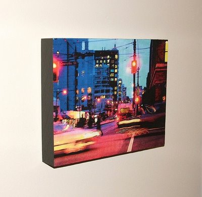
The first thing that occurred to me was that I could use my own digital photos, printed using a good-quality colour laser printer. Before I knew it I'd tried it myself and used the photos as collage elements in an acrylic painting. But recently I decided that I wanted to try the technique as a way to display digital photos as artwork. Here's what I came up with:
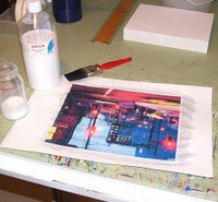 Using acrylic gloss medium, I applied ~10 coats of medium to my print. This took several days as I wanted each layer to dry completely. I used a small house painter's brush, stroking in a different direction each time. The resulting surface texture is a little like linen.
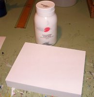 Meantime, I prepared the surface that would take the transfer. Opus cradled panels are perfect for this as the wooden panel is smooth, and the cradled sides mean it can be hung as-is to create a contemporary look without framing. But first they must be primed with several coats of gesso.
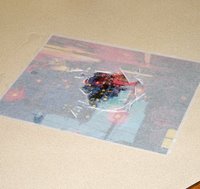 Once dry, I soaked the picture in warm, soapy water for a few minutes, gently peeled the paper off the back, rinsed and hung the polymer transfer up to dry.
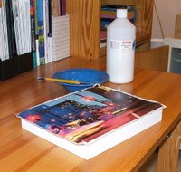 Next step: I applied a thin layer of my amazing and indispensable acrylic medium to the surface of the cradled panel and placed the transfer down on it. You will see that the image is slightly bigger than my 8" x 10" panel. I carefully pressed the image flat, working out the bubbles as I went. You will never master all the bubbles, no matter how careful you are, so I dealt with the last few stubborn hold-outs by pricking them with the tip of my x-acto knife.
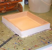 When I was satisfied that the image has adhered to the surface properly, I flipped it over and slowly cut away the excess transfer, using an x-acto knife. Take your time!
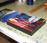 Almost there! I painted the edges using black acrylic paint because They say that 'black goes with everything,' but that's up to you. But wait! We're not done with our fabulously versatile acrylic medium. Cut 50-50 with water, gloss medium can make a decent varnish to seal the painted sides.
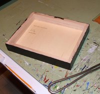 Putting hanging wire on the back of these panels is a bit tricky, so I used the kind of hanger you can get in any hardware store and voila! Photo art!
a cornucopia of weirdness
 Thanks to my not-so-secret source, here are some very strange must-have products, followed by a little offbeat photo and video art.
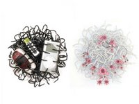
The first is this weird accessory for untidy people. It elevates anal to the level of cutting-edge chic. Or not.
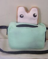 Next we have a handbag that will make Kate Spade owners green with envy. Only if they forgot to have breakfast, though.
But this last one is over-the-line in its surreal creepiness. To think that you can sleep with your loved one for the rest of your natural life, even if his has been over for years.
 But enough consumables and back to visuals. Take a loook at the photo art of Olivo Barbieri. To achieve his unique vision he takes photos from a helicopter using a tilt-shift lens.
To finish on a smile, this guy, the dancing traveller, clearly enjoys life. The soundtrack is half the fun.


