This is the hardest part of the painting: the imagery. I have been chipping away at it all day and haven't gotten very far, stressing about other things and spending a lot of time looking vacantly at my (lack of) progress. But after today it should come together a lot faster. Doing the mockup helps a lot. I spent 14 hours on mockups alone, so a lot of the decision-making has already been done.
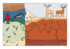
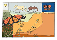
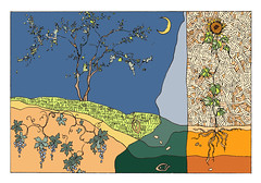
You can see that I sketched the basic shapes of the images in white conte first, and have already painted the trees, leaves and raindrops. Tonight I will finish the birds, deer and hoofprints before I move on. Sometimes I use stencils (and love the effect) for repeated images like leaves, but decided to paint them freehand this time so I could add the veining, which is really the underpainting showing through.
Tonight I will reward myself with the rest of season 1 of True Blood, flaked out in the den and watching it on Greg's laptop.
It's been donkey's years since I posted a series of 'real time' work-in-progress posts so I think it's time I took another crack at it. It might actually be more interesting this way and if it is, then maybe it'll inspire me to do more, um, inspired blogging. I've drifted away this past year and, as a result, so have my readers. (To those who still drop in now and then: I lurve you. Please comment. Don't make me grovel.)
So, it's back to work on the Texas Hill Country commissions. (I talk about the project here.) This is the first stage: cutting down and attaching the paper to an appropriate surface for support (a 30" x 40" stretched canvas in this case) then masking the image area. As you can see on the top of the easel, I printed the mockup on my new inkjet printer. (It's just a cheapie for workaday purposes that we got as an added incentive when we got Greg his Canon Powershot for Christmas. I actually use his camera to take my in-studio photos -- like these -- because my Nikon D70 doesn't have a wide-angle lens.) Then comes the underpainting in a complementary colour scheme to the final painting. Seem strange? Stay tuned, my lovelies, and all will be made clear. And, because someone requested a scale shot, here's me. Am I working in my underwear? Actually, it's my pyjamas, sort of. (And they even have little birdies on them.)
Funny what a small disaster will uncover. Last Sunday the sink in my laundry room got clogged as I was doing a super-sized load with extra rinse (of course). When it flooded it worked its way south into the storage closet that houses paintings and artwork. Fortunately most were unframed and I caught the flood early, but I had a couple of old cardboard portfolios of work on paper that I was keeping mostly due to sentimentality and laziness. I lost some. I also 'found' some and have scanned a few pieces, mostly for my own enjoyment.
My crisis also uncovered a snake-in-the-grass when I updated my FB status. Her gleeful response was decidedly vindictive but I bit my tongue (which was full of comebacks), quickly deleted it and unfriended her. Makes me wonder why she wanted to be my 'friend' in the first place. You really do find out who's on your side when the chips are down!
Anyway, I decided to scan a few of the pieces that made me smile. Some are from old sketchbooks, some are from a fashion illustration course I took in the late '80s, and there are a couple of photos I took then developed and printed in the art department's darkroom at UVic in the early '80s. And lo and behold! There was the one photo (taken with an instamatic 110 camera) I had of part of the mural I painted in my high school's science wing when I was in Grade 12. It survived at least 15 years, until it was 'deleted' in a major building reno.
A couple more of these personal mementoes are here.
Working for a designer instead of oneself requires proceeding with caution, as shown by these preliminary sketches ~ drawn in ink, scanned and then coloured in Photoshop. (See? I haven't completely abandoned Illustration Friday.)
Hazel Dooney and Robyn Gordon are two artists who live south of the equator and write excellent blogs, but that's just about where the similarity ends. Sydney artist Hazel Dooney is Big Time, a celebrity artist whose controversial work and larger-than-life personality are reflected in the big price tags and impressive sales of her work. Check out this short video clip; that's one of her assistants adding detail to a painting. I love reading her blog because she puts it out there, warts and all with no nonsense or inflated egomania, for public consumption. Lately she's been talking about the impact of the extreme toxicity of her materials (enamel paint) on her health. (Live fast, die young, and leave a good-looking corpse?) Those of us painting in suburban basements and clipping coupons have fantasies about being a Hazel Dooney. Thanks, Peter, for putting me onto her. Then there's Robyn Gordon, much smaller in celebrity stature but huge in creativity, craftsmanship and powerful imagery. Di knew I'd love her work because of the primal/tribal elements. And was she ever right! Better yet, I love her medium (wood and found objects). Robyn lives in a stunning part of South Africa and both her artwork and photos make me happier than chocolate and cheesecake. And check out this great blog post about her from Melanie. Unlike the pervasiveness of Hazel Dooney on the interwebs, Robyn doesn't appear to have a website but there's plenty to see on her blog and Flickr photo pages.
Passing of Glenn Howarth (1946-2009) - there's a celebration of his life happening Friday August 14th at the Art Gallery of Greater Victoria at 5:30 PM.
For a long time I've wanted to take drawing or painting classes with Glenn again ... almost as long as I've wanted to return to living on southern Vancouver Island. I'm not sure how this message made its way to me as I haven't seen or had contact with Glenn in 25 years (oh, the awesome power of the interwebs!) but he was probably the finest teacher I ever had. My first 200-level drawing class with him was an eye-opener because his expressive use of language was so far over my head that I didn't have the slightest clue what he was talking about! The man was extremely articulate and erudite and, once accustomed to his teaching style, I was a total Glenn convert. As quoted in this article:
Former pupil and friend Alan Hopper said Howarth was an intuitive painter, but had "an incredible scientific optic perception and a language of his own, which I called Glennese. So eloquent, so deep. He took no prisoners, never compromised on his work."
He had more impact on my art-learnin' than any other teacher before or since and my drawing style changed dramatically that year.
While doing a little web sleuthing just now I discovered that Glenn had started a blog about a month before his death. This is a recent painting I lifted from it. He was a gifted artist but I'm pretty sure his value as a teacher/mentor/friend was of equal measure. Too bad there's a ferry in the way of me getting to Victoria by 5.30. RIP Glenn.
PS There's a wonderful tribute to Glenn here and I discovered Tom Gore's photo (below) here.
I've been enjoying this last week in the studio, working on a real, live large painting again. I've done an awful lot of small drawings in the past 18 months or so but there's nothing quite like using big brushes with lots of luscious paint. Added to that has been the challenge of working on paper. I ended up using 300gsm Arches Cover which I cut down to 30" x 40" and attached to a canvas of the same size for support. Then I masked the image area with blue painter's tape.
Halfway through the process (click to enlarge WIP mosaic to the left) I discovered I'd made a major oops. This painting is for a Texas spa and is based on an earlier painting. As you can see, the earlier one has a small, stylized cow skull in the upper left corner. To help deal with the vertical-to-horizontal conversion problem I decided to enlarge the skull and make it more detailed/prominent. I even took the cow skull I got in Alberta last summer out of my garden and propped it up on Coco's studio bed, much to her chagrin, so I could 'paint from death' so to speak. I guess I should have cleared the alteration first as it turns out the designer of the space has nixed cow skulls; the images need to be soothing for the spa clients. I understand that but since I was on a roll I decided to finish it anyway. I don't know what to do with it now, though. It would need a very large custom frame to make it display-worthy, which is not currently something I can budget for.
In other news, Manitoba's Communicator of the Year (and blogger/mentor/writer/leader extraordinaire) Heather Plett has started a new and inspiring web project called What Are You Giving Away? I was fortunate enough to be her first guest blogger. (Warning: for once I ignored Oscar Wilde's belief that "Life is much too important a thing to talk seriously about.") I think Heather is really onto something with this idea.
...or Bob and Doug meet Tom and Lawren. Check out the article here and make sure you view the slide show and read the comments. If Diana Thorneycroft's aim is to be provocative she has (if you go by the feedback) succeeded, using that decidedly Canadian tendency to be self-deprecating to do it. Whatever your opinion on the aesthetic merits of her work, though, I, for one, enjoy the fact that she doesn't take herself too seriously:
"I wouldn't teach photography if they paid me a million dollars, because then I'd have to learn how to do it. ”
I have a really hard time with transitions, especially when it comes to doing something 'hard'. I remember at university my roommates saying, "Andrea's cleaning the toilet. She must have an exam". It's not just laziness and procrastination, though; once I get going on something all-consuming I also have a hard time stopping. So when I take a break from painting something large or working towards a deadline/finishing a project I know that, somewhere down the road, I will have to face another excruciating climb back into the driver's seat and it freezes me. Tomorrow I plan to thaw out. Or the next day.
Seriously, though, I thought my problems with compulsiveness and inertia were simply more dirt in a laundry list of character flaws I mostly try and suppress. Then I read this:
When you're operating on the maker's schedule, meetings are a disaster. A single meeting can blow a whole afternoon, by breaking it into two pieces each too small to do anything hard in. Plus you have to remember to go to the meeting.
Hallelujah and pass the Comet! It turns out I'm a 'maker' rather than a 'manager'. Or, rather, I am both a maker of art and the manager of a breathtakingly-busy household and the two are effectively incompatible. Art making requires an intense level of focus and it's so much easier to fall into the default position of making lunches and driving to soccer practices as it gives me the illusion of being somewhat productive. But once I get going on an art project I get behind in my Other Job and general panic ensues. I guess that's why Picasso and other celebrated makers had/have a phalanx of assistants and a bomb site of a personal life. You can't have it both ways.
Anyway, this article is about the corporate world (specifically startups) but applies to anyone like me, trying to balance two basically incompatible roles. Now, please excuse me as I have a bathroom to clean.
So, I have this commission to do and the client, a spa in central Texas, wants the three paintings painted on paper so they can be matted and framed. The image size is unusually large for paper, 25 1/4" x 37 1/4", and since I've ever only painted in acrylic on rigid surfaces and canvas I could see that this was going to be a learning curve for me. On Friday I went to Opus so I could see what's available and pick the brains of the employees. The thickest, least absorbent paper I could find was illustration board, but it's not archival, so I ended up buying an 8" x 8" pad of Rising Stonehenge (100% cotton 250gsm) with which to experiment. Certain papers were not available to me as they weren't available in large sizes.
Yesterday I applied two coats of gesso to a sheet of the Stonehenge and painted a teeny-tiny (4 1/4" x 4 1/4") house portrait on it to see how it worked. I was pleased with the results. The gesso adds a bit of texture to the ultra-smooth surface and after the painting was complete and dry there was no buckling. Working exponentially larger might be a different matter but I'm confident enough to buy the large sheets now and forge ahead. Ellen let me know that using gesso with calcium carbonate on flexible surfaces can cause cracking when dry. (See? Facebook is a good thing.) Thanks, Ellen.
If anyone has any experience in painting in acrylic on large sheets of paper I'd love your feedback.