opposites
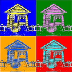
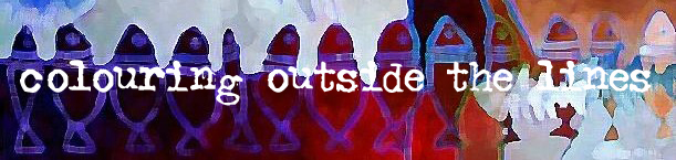
While visiting vfm4's Flickr page (one of my favourite web-stops) I discovered St's Flickr Warhol. Since I had nothing to post for Illustration Friday this week and hadn't gotten around to doing what I still may do for it, I thought this might be a good stop-gap. The original is here.
posted by andrea at 8:11 a.m.
![]()
![]()
18 Comments:
Hi Andrea, thanks for the comment, I would love to do the lavender fields but they are down in Provance, Im planning loads in my garden tho so maybe in 2 years time. Im off to explor your links now...
it's electric, love it!
Buen resultado.
Saludos
Very pretty and eclectic, I like it! Just read Carla (Anonyrrie)'s review of your art, it rocks!
Cool use of color!!
Thanks for posting the warhol link. It's really cool and solved the problem of how to take a so-so picture of someone and turn it into their birthday card. I'll look forward to seeing what you end up doing with opposites later. Thanks for the comment on my cat drawing.
hello andrea, i am a fan. carla did one incredible ob "intoducing" you, matched totally by your fantastic work. i can't offer words that capture the vibrancy of what you offer.
thank you, thank you. i'll enjoy visiting your blog.
kj
I just come from Carla's, Anonyrrie's, blog, she recommended you - and she's just right! I like Warhol too - but I like the original yellow house most - with all it's warm and funny details. Thanks for looking.
Stop-gap? If you say so.
Love it! That is what I had in mind as well.......but haven't done it yet. With the image of your painting is just great! How did you do that?
This is really cool, Andrea! I like the Warhol thing...here it looks great with the house. I could actually see this as a poster with its strong graphic look.
You know I love this!!!! The color is wonderful & your house has always been a favorite of mine. ; )
Smooch,
The Tart
; )
This is very cool. Each one of your pieces is so unique!
Gosh Andrea, Carla is right you could turn this or some of your other work into posters with this look.
your lines lend themselves quite well with this.
I love these pop art style illustrations! A perfect way to take your perfect paintings and change them up for a quick illio! I love the green and pink one best . . .just saying. [ =
I've missed a lot by hanging out of the loop the last coupla weeks. What a treat to get back into the swing... Saw Carla's great post on you... very cool.
I like these variations of color... and the opposites afforded by the color spectrum. And your 'Sow's Ear' discussion provides a lot to chew on... definitely something produced for the brain. Peace to you.
I love these and the yellow house!!!
OH! This is cool. I like it a lot.
love
Post a Comment
<< Home