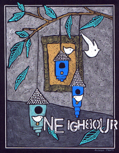
junco
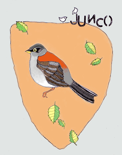
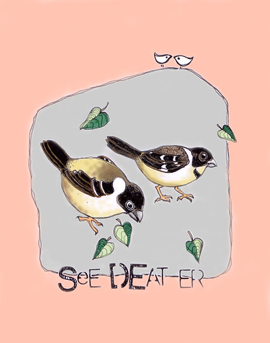
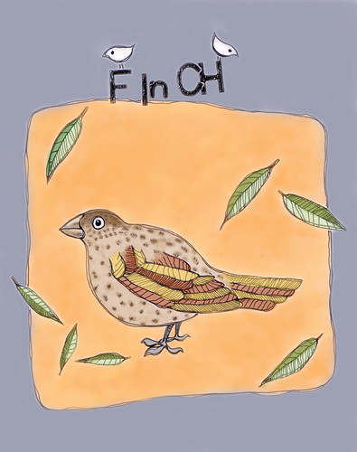
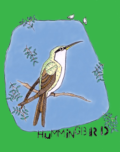
pen-and-ink drawing digitally coloured
This has been really interesting. Feedback tells me that the text elements I've been adding to some of my drawings suck. And what do I have to say about all this outrageous criticism? THANK YOU THANK YOU THANK YOU. It's good for the ego when I get positive comments, but I really need this kind of feedback, too. Of course, incorporating the criticism of others must be taken with a grain of salt. My newest guru says, "You don't know if your idea is any good the moment it's created. Neither does anyone else. The most you can hope for is a strong gut feeling that it is. And trusting your feelings is not as easy as the optimists say it is. There's a reason why feelings scare us." I think this is great advice if you have a groundbreaking idea, but this ain't it. And since I've been forced to reflect on it now I see the point. Personally, I love the edginess the text adds, but the 'venue' is all wrong. These are not gritty, urban pieces, so maybe not such a great fit. Critics: 1, Artist: 0. But hey, if you like the dichotomy (and tomorrow I probably will), please tell me. As Woody Allen said, "I need the eggs."
As I mentioned here, I made five of these pen-and-ink drawings, so there's one to go after this. You'll have to put up with wonky, mismatched, backwards letters one more time. I haven't got the 'discretionary investment funds' to print up a run of these anyway, so they'll have to remain in the virtual world. But that's probably a good thing as I learn more about Photoshop. I used the magic wand on this one and discovered that because I don't completely close the areas up, it didn't work perfectly, so I might change that in the future, though I did choose to do it because it works well with the wavering double lines.
It's all a process.

