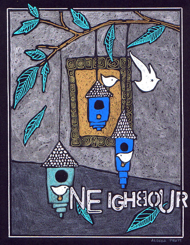
neighbour
 This was a fun one to do for Illustration Friday this week. Question: do these drawings work better with or without the wonky stencilled text? There are versions of both here.
 chez Etsy
 This was a fun one to do for Illustration Friday this week. Question: do these drawings work better with or without the wonky stencilled text? There are versions of both here.
22 Comments:
OHH this is amazing!! I love it!!
Andrea,
I love your drawings and I admire how you do the background. I don't know why I am so drawn to backgrounds but there is something in the strokes that attract my attention in a most delightful manner. I think that the "wonky stenciled text" are alright if something is intended for a specific purpose, like for example Illustration Friday. I also like the English spelling of the word. Of course your illustration could mean other things too. Personally, I think it is a beautiful image of spring and you are right, we build birdhouses soon inhabited by birds who become our most desirable neighbors or neighbours just like the butterflies.
I really enjoy the wonky words! Both ways are pretty wonderful though! The words bring it to a playful and fun level! Love it!
This is gorgeous- I don't mind the type, I like it. I guess it depends on what the use might be.
i'd leave the lettering on this one, andrea. it is so obviously a neighborhood it is fun to know that implicitly (just my opinion)
since i love birds and birdhouses, and i love your work, this IF delights me.
:)
I love your artwork and style! And the stencilled words kinda complete the picture in your unique way! Coolness!
Edric
http://merman13.livejournal.com
What a friendly neighbourhood! Well done, Andrea!
I like the stencilled text!
The colors you use are so soothing - deep. Great illo!
I love this and the stenciled words add balance and interest! Good work!
Sweet .. Tweet, Tweet!
Smooch,
The Tart
; *
I love the "neighbour", lettering and meaning. Somehow it pulls me in, grabs my attention, lets look at the picture with more depth, gives it one more dimension, and I like that.
(And now please smile at how hard I am trying to say yes to the lettering. *grin*).
Beautiful drawing! It looks good with the text, but I'm sure it would also look good without it. Not much help, am I?
love the illustration... would love it more without the letters. the birds and the houses are so sweet - with the letters it distracts me a bit. but that is just me!
xo
susan
I'd like it better without the word - & is there another way to spell neighbour?
Your drawings are all terrific but, I think I prefer them without the text so I can formulate my own thematic thoughts. On the other hand, the text doesn't detract either. I love your work.
Ian
Very good, thank you, have a good day
I really like the lettering, but then I seem to be into wonky letters lately. LOVELY work.
wow, your work is just beautiful! and, personally, i do like the text... i think it just adds one more nice layer of texture and meaning.
Such a good piece! I think I'd like it either way, lettering in or out. Doesn't really need it, but it doesn't hurt it either.
This would go well with the one I bought for my friend ... nice job.
Like this style!
Your images are so beautiful - both with and without txt. Great!
Post a Comment
<< Home