broken

I'm actually on top of Illustration Friday after missing it last week. I really needed to pull out the drawing tools and give this a go today.

I'm actually on top of Illustration Friday after missing it last week. I really needed to pull out the drawing tools and give this a go today.
23 Comments:
as i already said: you did it again.. lovely, lovely...
This is wonderful. I love the patterns, the mark-making and the muted palette. Is it a print...perhaps a monotype? Whatever it is, it's very nicely done.
Is this another crayon on paper? Again beautiful; like the details of the broken tree when not so broken :)
Very good hand at drawing. Effective illustration.
OOO... Wonderful work I love the dark images.
love
This is so beautiful! I like the play of gray color scheme, but I'm also little confused...is it a print?
This is beautiful! I just LOVE your work! It makes me catch my breath! Mary :-)
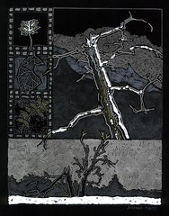
This is a drawing using a variety of white and metallic mediums (coloured pencil, gel pens, Sharpie and even white-out) on archival-quality black paper. It's almost like "directed doodling" -- fun to do.
This is great!
Another good one, Andrea! I really like the three blocks on the left. It looks really, really nice in the large size...your pen lines have a lot of texture and variation that you can's see on the small picture. Brava :>
This is lovely
I like this a lot, the framing and various elements fit together superbly.
Detlef
http://www.detlefjumpertz.com
The fact that I scanned it just slightly tilted because I was in a hurry to post it is making me just about crazy every time I see it now. Haste makes waste...
This entire series is so expressive, dark & moody with an underlying passion that makes my mind stop for a moment or two while attempting to suss things out. Anyway, WOW!
I love how rich this is. It seems more colourful than its muted palette.
hi! i didnt know about your blog, nice1 i like the paintings or drawings!, i ll be back.
This is beautiful. Love the textures and the lines and the separation of the bigger design from the smaller ones. Great idea.
This is quite lovely. It has an icy winter feel to it. I love your style. Cheers!
the combination of texture and rich greys give this a magnificent quality.
Nice illo!! Lovely as always!! :)
Hi! Nice illo! Me too love the darkness of this one... BTW Thanks for the nice comment on my blog. I'm suppose to have my PC back...today... (I'm postint from work)..But I'm not sure... And all those files I have lost, and all those program..ARGHH!
Did you have some news about this gallery?
Excellent image! I really like the composition.
Gosh, I just love the look you get when you use a black background. I think this is a vonderful image, I just love it.
Post a Comment
<< Home