drawing demo
Two weeks from Saturday I will be at Effusion Gallery in Invermere for the opening of a three-person exhibition based on the seasons. From 2 until 5 that day I will be doing a drawing demo, but since the gallery is tucked into the Rockies in a small resort town a couple of hours west of Calgary, chances are that anyone who passes by this blog will find the commute just a little unamanageable! With that in mind I thought I'd document the technical progress of my latest mixed-media drawing here for thems that's curious.
I've been using acid-free 19" x 25" Strathmore 400 Series 160gsm black paper for this series, which means I have to cut away two strips from each sheet to get the 14" x 14" size I need. At least it leaves me with a nice 11" x 19" piece for later use.
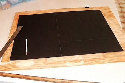 The first thing I do is use a white Crayola pencil to mark out the 10" x 10" image size. I make thumbnails in my sketchbook first so I can 'assemble' the different elements in a way that works, then I divide the 10" square into the basic sections I need to work in.
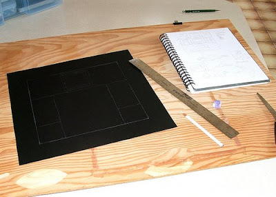 Next I do a basic white outline of the main elements. This composition features the rowan tree in winter (January 21 - February 17), shown in the main body, and the leaves/berries in the small window above it. The green dragon (or, in this case, rat with wings) is one of the two related creature symbols and one of the associated gods is St Brigid, so I include the St Brigid's cross (made from rushes), a favourite symbol of mine ever since my friend Molly sent me an actual St Brigid's cross last winter. I totally forgot an element that I always include, though -- can you figure out what it is?
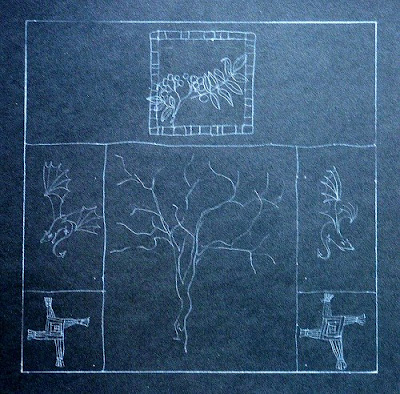 Using Prismacolor pencils and some gel pens for highlights I draw the main pictorial elements. My tonal plan for this, being winter, is mainly white/silver monochrome but the red berries of the rowan tree and the green dragon are important and complementary spots of colour. I usually include a patterned section but am having real trouble coming up with any ideas for this drawing and at this point am still thinking about it.
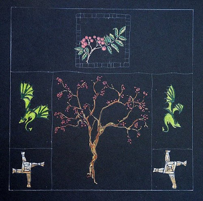 Starting to fill in the background, I choose a white Crayola pencil (these cheap but useful pencils are much less opaque than a Prismacolor) to add tone to the area behind the tree, a silver Sharpie for a textured background behind the dragons and one of my favourite drawing tools, a silver Pilot Super Color Extra Fine permanent ink pen to add the background to the St Brigid's cross panels. The spiral frame around the berries and leaves is done with a Gelly Roll medium point silver gel pen.
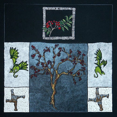 To finish, I use a white Prismacolor pencil to set off the berries and leaves. Check out the difference in opacity between this white pencil and the Crayola! And I finally decided that the patterned area would be a network of bare tree branches. I use both types of white pencils to create the branches and decide on a muted gold background. Since I can no longer get a replacement for my beloved pale gold Gel Works Metallic marker I decide to use a gold Prismacolor pencil first, then layer silver Prismacolor over top to get the muted gold tone I want. I think the effect works great! The finishing touches include a silver border, using my Pilot pen, and I sign it with the Prismacolor white. In the lower left hand corner I include the Celtic rune for the drawing's theme (Luis).
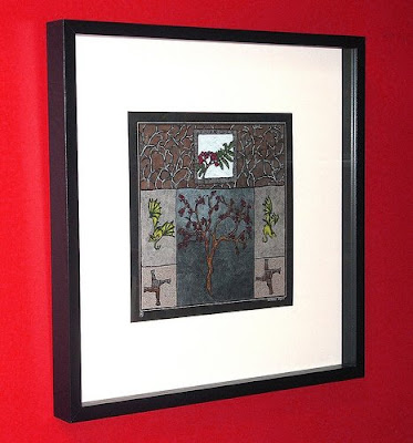
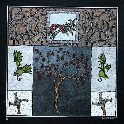 Final stage: the frame! This 20.5" x 20.5" x 2" black wooden frame with glass comes with a white mat and I use acid-free tape to attach the drawing to the mat.
 I'm in the home stretch ~ only three drawings to go! As I finish them I add them to my website here.
I've been using acid-free 19" x 25" Strathmore 400 Series 160gsm black paper for this series, which means I have to cut away two strips from each sheet to get the 14" x 14" size I need. At least it leaves me with a nice 11" x 19" piece for later use.
 The first thing I do is use a white Crayola pencil to mark out the 10" x 10" image size. I make thumbnails in my sketchbook first so I can 'assemble' the different elements in a way that works, then I divide the 10" square into the basic sections I need to work in.
 Next I do a basic white outline of the main elements. This composition features the rowan tree in winter (January 21 - February 17), shown in the main body, and the leaves/berries in the small window above it. The green dragon (or, in this case, rat with wings) is one of the two related creature symbols and one of the associated gods is St Brigid, so I include the St Brigid's cross (made from rushes), a favourite symbol of mine ever since my friend Molly sent me an actual St Brigid's cross last winter. I totally forgot an element that I always include, though -- can you figure out what it is?
 Using Prismacolor pencils and some gel pens for highlights I draw the main pictorial elements. My tonal plan for this, being winter, is mainly white/silver monochrome but the red berries of the rowan tree and the green dragon are important and complementary spots of colour. I usually include a patterned section but am having real trouble coming up with any ideas for this drawing and at this point am still thinking about it.
 Starting to fill in the background, I choose a white Crayola pencil (these cheap but useful pencils are much less opaque than a Prismacolor) to add tone to the area behind the tree, a silver Sharpie for a textured background behind the dragons and one of my favourite drawing tools, a silver Pilot Super Color Extra Fine permanent ink pen to add the background to the St Brigid's cross panels. The spiral frame around the berries and leaves is done with a Gelly Roll medium point silver gel pen.
 To finish, I use a white Prismacolor pencil to set off the berries and leaves. Check out the difference in opacity between this white pencil and the Crayola! And I finally decided that the patterned area would be a network of bare tree branches. I use both types of white pencils to create the branches and decide on a muted gold background. Since I can no longer get a replacement for my beloved pale gold Gel Works Metallic marker I decide to use a gold Prismacolor pencil first, then layer silver Prismacolor over top to get the muted gold tone I want. I think the effect works great! The finishing touches include a silver border, using my Pilot pen, and I sign it with the Prismacolor white. In the lower left hand corner I include the Celtic rune for the drawing's theme (Luis).
 Final stage: the frame! This 20.5" x 20.5" x 2" black wooden frame with glass comes with a white mat and I use acid-free tape to attach the drawing to the mat.
 I'm in the home stretch ~ only three drawings to go! As I finish them I add them to my website here.
21 Comments:
What a great demo/tutorial! Thanks so much for this and for the links to supplies(which are of no help to me!)
I feel so familiar with these I'm not going to "guess" the missing element!!
Intersting. I sometimes watch as my son crtoons or sketches nd I am always intrigued by the pain-staking work he puts into it.
Thanks for the in depth look into your process. Great work and good luck with your demo.
Wonderful to see how you work! And always with such great result.Good luck with the exhibition and demo's. Wish I could be tucked away in the mountains for a day or two.
Dinah: Party pooper! As for the supplies, you'd probably be able to find some of them at an art supply or staionery store.
Citizen: It's one of those all-consuming activities that blocks the world out.
Jamieson5: Thanks. It's boring reading for many but interesting enough for a few that I thought I'd give it a go.
Laura: One day!
I really enjoyed seeing the process. Thanks for sharing this.
Fabulous, it almost looks like embroidery!
Sandra
I love this series, and I love the variety of drawing media you're using. I always enjoy seeing your process... it adds to the magic of the finished piece:) Lovely!
carla
Thanks for the demo - your imagery looks great at every stage. Hope you have a successful day at the gallery!
Down to the crunch, it's going to feel so rewarding to see this great series complete and hung.
BTW, I had a friend over yesterday who greatly admired your drawings on my mantle, they really class up the place.
So fun to see your process on these, and to have you list the various materials you use.
I think this is a terrific series. Wish i *was* close enough to see them hung!
Andrea, thanks for showing us how you achieve such wonderful pieces! Also thanks for listing your pencils and pens, very interesting. I love your unique work.
Again, love this series and your demo was wonderful. Have fun in the mountains!
Paula: Thanks -- it's fun for me to share it.
Sandra: I love that it looks like embroidery since I'm such a klutz with needle and thread!
Carla: It's one of those love it or BIG YAWN sorts of posts, depending on who's reading. I'm glad you enjoyed it.
Barbara: At least the earlier stages of the drawing process usually don't look better than the final image -- something that often happens when I'm painting! :)
Ellen: That's feedback I like! I'm so close to finishing that I'm hesitant to go for a hike today, wanting to just bulldoze through, but probably need the break.
Tara: When they finally are hung as a unit it will be as much a relief as anything!
Deborah: Thanks. I even gave my son a lesson in the process yesterday. I'll have to post his work later.
Michelle: I'm hoping it works as well in real life!
ok ok I need to get back into the game here and start checking everyone out. I am missing so much and nearly missed your process here. You know I love these kind of posts and just excited over your work. Good luck with the show. I know you will do well. Thanks for showing your step by step.
fascinating! I LOVE peeking into a work process like this!
something has gone so wrong in our culture - creating things, singing, dancing - all used to be activities that everyone participated in and so you got to watch others 'at work' and learn from that. Now it's all closed off and people are isolated from process. I'm delighted that you're doing a demo, and even more thrilled that you posted it here.
I'm not suggesting that all art is equal, only that all should feel able to participate at their own level, yet most of us have no idea how to even begin.
Awesome Andrea! Thanks for posting the process I found it so very interesting.........your gonna sell out on opening night!
Very cool Andrea - I love seeing another person's process.
Good luck with your drawing demo too!
Andrea, I'm in awe. That picture is just beautiful. And fascinating to watch the process. Thank you for sharing.
Toni: Thanks for the encouragement -- and did you see my post where I talked about the Mergansers?
Hayden: I know! I started playing guitar this year and it's such a different pleasure from listening to it, no matter how lousy I am. We have become so passive.
Melody: Wouldn't that be amazing -- and a miracle! I'd be happy to sell something.
Cynthia: I'm nervous already. :)
Alda: And thank you for actually looking/reading. I thought it might be really dull for non-artists, but then you're married to one and have your own creative process, so...
Andrea, you make it look so easy. I remember seeing an interview with Yo Yo Ma where the interviewer said he made it look so easy. He said "It is easy after you practice and practice and practice." This must be the same. Thanks for the demo.
Mike
Post a Comment
<< Home