
website revamp
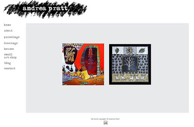
It was actually fun redoing my website, even if it took three days. I added the slideshow feature that I've admired on other art websites, tried really hard to edit myself (only partially successfully) and keep it simple and professional looking. I'm thinking it's pretty good for a hack like me who uses online tools, knows very little HTML and hasn't taken a single instruction in web design. But I know I've missed things, have made typos and there is probably a broken link or two, so please visit, look around and click on a few links. How is the width of the pages on your monitor? I would really appreciate any feedback!
posted by andrea at 12:08 p.m.
![]()
![]()
21 Comments:
Looks great to me!
I know even less about making a website, so I let Artspan do it. I admire those who can do otherwise.
It doesn't fit onto my monitor. It seems to me that many web pages these days are designed for widescrean format...which I don't have.
Just did some fiddling with my screan's resolution, and the home page of your website fits on my monitor if I have it set at 1280 x 720 but everything looks pretty squishy that way.
Andrea, I love your new website. The images are crystal clear and I love scrolling through them (especially November Sky, which is hanging in my office!!!) Nice job! Ann
Angela: Having someone else do it is very wise time management. I update frequently but redo it only very occasionally so I find myself re-learning things that designers can do in their sleep. I do enjoy it, though, and becaue of "control issues" find it suits me. :)
Brian: You're still out there! I'm thinking that 1280 is still standard. I have it sized for 1400 so am thinking that maybe I should redo it. I'll wait for more feedback and see what the concensus is.
Ann: Good to hear from you -- and thank you!
I like it! The images are very well done, and that's most important on an art site. Of course, it helps that all your images are so wonderful to begin with :)
I have two (!) wide-screen monitors, so I've got none of the mentioned display issues. You might want to take a look at web statistics before you decide what width you'll (re)design for. The stats at w3schools show that, of their visitors, 57% have a display wider than 1024 and 36% are at 1024. http://www.w3schools.com/browsers/browsers_display.asp
Of course, mostly techno-geeks visit w3schools, and they're more likely to have large monitors.
HTH
Beth: That does help -- thanks! Speaking of technogeeks, I asked my husband to ask his techy friend at the office to look and he said, "It looks like a baby on his monitor!" so there you go! Maybe I should go with 1024 as middle-of-the-road, though, from a pure desin pov, I do like how it looks sized for a wide screen.
Very pretty! But I, too, have to scroll sideways to see the full width. Not a major problem (have to do this on many web pages!)and most professional folk these days have "bigger toys."
Kudos to you for the DIY effort.
Andrea it looks great on my macbook.
My screen is set at 1280 x 800
I love how you regrouped the images, feels nicely organized. It fits nicely on my main computer, but not on my smaller laptop. Personally I'm not a fan of the bottom scroll, just because it takes away from the aesthetics when something's cut off, so I'd opt for making it work on the smaller screen. (man, you ARE prolific, you're my inspiration!)
Dinah: I just tried resetting my screen resolutions at both 1024 and 1280 (yours is probably 1024) and am amazed at how much better it looks at 1400 pixels wide. You should do the same with yours (if you use a PC I can explain how -- just email me).
Toni: I tried 1280 and, like you, discovered it works fine at that width; it's only at 1024 that the sideways scrolling is necessary.
Ellen: At first I had them in horizontal strips (it looked so tidy) but then I caved to the grouped look because I like it, too. About resetting your laptop monitor: do you know how wide yours is set at? (See what I said to Di above. Yours is a Mac, though, right?)
never mind, don't know what happened before. Fits fine and looks great. (WISH i had a Mac)
Beautifully done, Andrea. I made the tour and it went without a glitch in the areas I explored. Easy to handle, logical, and your work is a wonderful as always. May it serve you well. You deserve it.
You are so kewl!
I can only dream about having enough patience to attempt this.
Who am I kidding I change my blog template twice a month.
You give me hope
to car-ry-onnnn
you light up my days....
Thanks all. And thanks a LOT Donn for the vile earworm.
Congratulations Andrea, it looks great. Doesn't fit my screen either, but my Sony Vaio is quite old and I'm due for a new computer as soon as the ship comes in (LOL). But you did well.
Thanks, Laura!
Very nice! Everything that I clicked worked, and it filled up my whole screen nicely. I especially like the photo of you in a black sweater.
looks good on Safari and Firefox at standard settings! Fully contained on the monitor...and that's a huge big deal. I find I stop going to sites when their page doesn't fit on my screen.
looks great Andrea, no size issues on my laptop either and it has a smaller screen :)
I really like how you have grouped your paintings together and enjoy knowing how many are in each slide show so I can go back & forth. I had no idea you had so many wonderful paintings, wow :)
One suggestion I have though would be on the home page to have the images link to each gallery (ie one image for paintings, one for drawings & one for houses (or just the two images if you prefer the layout) That way users are taken directly to the gallery, just my preference though :)
Hi Andrea ... I'm very impressed.
My Sony laptop has a wide screen (1440px), so no probs viewing your website.
I'm also impressed with how you've added PayPal onto your Blogger art gallery.
Really lovely art work, and a great photo of you too.
Post a Comment
<< Home