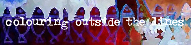
website revamp
 I think I've given myself carpal tunnel syndrome. I've spent two long days rebuilding my website and I'm pretty pleased with it, but haven't checked everything out so if you take a look, please click on a few links and let me know if you find any broken or weird ones. I really like the clean, uncluttered look of black on white (it doesn't compete with the artwork and God knows I hate competition! :), which is why I went with the original Blogger template (and have kept it) and why I went with this new look on my website. The only problem was that my favourite fonts weren't available by my web hosting company so I had to dig around a bit to work my current favourite 'Adler' into the mix.
avatar by Hellcat
posted by andrea at 2:28 p.m.
![]()
![]()
17 Comments:
I agree with you about the black and white simplicity for your website in order to let your artwork shine, which it does! The colors really jump out at you! Good job, looks GREAT!
Great job, Andrea!
I like your layout but the font is not a particularly good fit with your artwork...
Looks good :-) I can't say I agree with bb49 about the font. I think it fits.
Incidentally, you might want to take a look at your template header - between the "title" tags, your page name is given as "untitled1", and this is refelected in the window title bar when the page is loaded.
You go, girl! What an accomplishment, I love the look, the spiral bound side especially.
I happen to like the font. Have looked at the "bad cat" page, of course (ask Freud, must have to do with my feelings about this being Friday - heeelp! - already and still so much to do before weekend starts).
I hope you get to celebrate after all this hard work!
I had a good look around your website and I think it is very easy to navigate. Your stuff is really beautiful!
By the way, what do the little red stars next to the name represent?
I looked at every link, they all worked well. I agree the whit background is perfect with your work, the font was good for me and I really like the spiral bound side. I am needing to re-do my website as well and I got some great ideas from your layout. It looks very professional and smooth...good job!
Looks great Andrea. You have inspired me to get back to work on my website. I started one last year, but never get around to finishing it.
your site is awesome andrea! :)
i love lots of white space and simplicity. :)
I am totally unsure as to how I got here..but I have already subscribed so I don't forget.....I like the uncluttered look...I too went for a more streamlined look when I switched from my now lost in cyberspace blog to my new place. I am looking forward to clicking my way through your place here...as soon as the late Friday afternoon hub bub dies down!!!
It looks really great, Andrea! I do like the white background to showcase the brilliant colors of your art. I also really like the way you've arranged the pages into the various series, combining the paintings and drawings. And wow... there's so much! It was certainly worth the time and effort:> Brava!
it looks great, andrea. everything you do is underscored with class.
bravo.
:)
Wow, Andrea. The site looks REALLY good. Easy to negotiate. I especially love the primal landscapes page. It's like having that wall that's big enough to see them all at once, minus the one, of course.
Makes me feel like buying something.
I also checked out your navigation links and was also going to mention that you should add page title attributes to your each page on your site. When you look at the very top of the web page it shows up as untitled.
I would also add alt" " tags to your images so if anyone is doing an image search it might show up as copyright symbol Andrea Pratt when you hover over the imgage. The font doesn't bother me it has a kind of funky-eclectic quality like your art work.
I also question the Gallery navigation link and then all the galleries which are also spelled out just underneath. It seems a little redundant-but that's minor really. Maybe have those pages be sub pages under the gallery link with only 1-2 really strong images on your home page so we don't have to scroll down. Make it enticing so people want to enter.
Otherwise, you have been mighty prolific girl! Was that more than you asked for? I am also working on a new site in Golive so I applaud all your hard work! It's a huge undertaking.
Great feedback guys, thanks. I've been in the land of many noisy houseguests for two days and am just emerging...
Catbox, Angela, Jamie, KJ: Thanks!
BB49: I just went with what I liked. My work lacks that 'industrial' edge that Adler has, but oh well... :)
Kyk: Thanks for pointing that out. Unfortuantely I can't edit the source code using the Homestead software. I can look at it and yell at it but that's about all! Actually, I do have some ideas to test drive on hacking in. I can tell you one thing, next time I build a new page from scratch that is to replace an old page I'm not making a 'dummy' page like I did this time. When I changed the URL to replace the page I'd rebuilt, the title remained the same as my dummy title. Stooopid or wot?
Merisi: Bad Cat doesn't even deserve a page of its own yet, but I'm trying to save myself future work. That usually backfires, though, doesn't it? :)
Cream: Thanks -- and the red dots signify the red dots you see on sold artwork in galleries. Unfortunately they look more like stars as you said...
HMBT and Heather: Oh good -- I like to think all that work inspired someone...
Danielle: Your blog is very reader-friendly. (I had a peek.)
Carla: And I edited a bunch out, too.
Brian: That's what I want to hear, but you've done your fair share. Go out now and inspire others to but instead! :)
Cynthia: I'll admit that I got to a certain point and hit a wall. I really have to go back and do some fine tuning and tinkering but need a break form it first to do something like, oh... painting maybe? :)
Brian: No inspiring others to but. Buying heavily encouraged, though.
Wow, you have been a busy bee. Your paintings are fabulous, Andrea, and your website is great.
I found some of your art work slow to load up on my computer (I've got a 1MB Broadband connection), so I wonder if you'd like to experiment with smaller picture sizes sometime. I've have a look through Cynthia's lovely site ... a lot of her pictures are much smaller, but she's managed to retain their quality.
I've recently changed my background colour to a white with a hint of yellow, which I find is kinder to my eyes... F0FFF0.
Post a Comment
<< Home