colour clue
 I'm having fun with this series, though the challenges of size (4' x 4' or 122 cm x 122 cm), composition and, most of all, colour mean that for the four to five days I spend on one of these I do little else except the minimum household/family necessities. (Sorry I haven't been posting or visiting many blogs lately.)
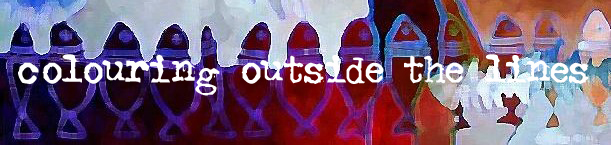
 Someone recently asked me about colour. I have a different approach for each group of paintings but they have elements in common. For the last two paintings I have chosen either a warm or cool colour palette (saturated), but have chosen to 'punctuate' each painting with a few examples from the other temperature. In this case I added a few touches of yellow and red to the overall cool blues and greens. I also use cool or warm neutrals to conform to the palette choice. Cool grey is used here. As for the underpainting, I don't have much of a plan beyond using complementary colours to the colours I plan to use on the final painting.
Last night we played Clue for the first time in ages. Besides it being tons-o-fun, I realized what a great analogy it is to the way I paint. Since I start with only a vague idea of colour, I will often sit and stare at the painting for ages, trying to figure out what colour to use where. (Composition is rarely an issue as I usually work all the compositional problems out in my preparatory sketches.) Like gathering clues in Clue, the more I paint, the clearer the solution becomes. It builds on itself. Not to say that I don't make plenty of mistakes, but the more deliberate the process the fewer times I have to repaint an area. That's a huge budgetary bonus (both time and money) when working this size! I must also admit to some aesthetic guilt as I work out the colour, as I'm striving for the most harmonious combination with maximum impact. Eye candy. But at least Tolstoy agrees with me that it's not necessarily a negative thing. In What Is Art? he said:
The assertion that art may be good art and at the same time incomprehensible to a great number of people, is extremely unjust, and its consequences are ruinous to art itself...
There is nothing more common than to hear it said of reputed works of art that they are very good but very difficult to understand. We are quite used to such assertions, and yet to say that a work of art is good but incomprehensible to the majority of men, is the same as saying of some kind of food that it is very good but most people can't eat it.
Hooray to Tolstoy, even if this quote is often used as justification for the banal. (Uh-oh.)
Next lesson: choice of images and symbols. (My favourite one here is the stencilled lobsters down the right-hand edge.) I just know you'll be waiting with bated breath.
posted by andrea at 1:00 p.m.
![]()
![]()
16 Comments:
...maybe even "baited" breath!
Lobster is in and one of the local Toronto eateries, (known for high-end pub food), called Allen's is having a Lobster Fest tomorrow night. I have the early seating reserved for me and three lady friends.
I was an avid birder when I was still living in California. I really like the heron in this painting. You really work magic with bold colors. I'd never attempt to decorate with them, but if I had that on the wall...I'd get away with it!
everytime I come here andrea .. u amaze me with your painting .. have you ever thought of painting something .. I dunno .. some religious painting or carvings I dunno with text from another language .. or script? like the placement of text actually resulting in the meaning of the picture ..
this one is awesome .. at first it looked something like what I am talking about above .. i see flags ..
Andrea! This one is glorious! I love the blues and greens, and although you call them cool (and of course, they are) there is such a jewel-like glow that shines through. The texture of the water (?) above the fish skeletons almost vibrates, and I love the lyrical scrolls around the heron. This looks like a fusion of elements I've seen before, but with touches of a new direction...new motifs and designs. Wow!
You are very brave to just jump in to your paintings without a color comp! I do any number of those anymore before laying down anything more than the most general of washes... But that's right - you said you were a 'color' person, rather than a value person. I tend towards the value end myself, and feel lost with color unless I plan it out.
I like the Tolstoy quote - and hopefully you can get past the banality-tendancy by thinking about eating gourmet chocolate vs. Kraft macaroni and cheese...
The process sounds a bit like archeology - you're brushing away the covering to reveal the artifact hidden beneath.
Hey, a couple of links to a Greenwich Workshop artist, Kim Wiggins, whose work reminds me just a little bit of yours (mostly in the vivid use of color and texture): www.greenwichworkshop.com/thismonth/june06.asp?lockoutDealerID=456#wigginsA, and www.greenwichworkshop.com/thismonth/june06.asp?lockoutDealerID=456#wigginsB
Great painting - I'm in love with the red-edged green fishbones...
This one feels like its made from geodes that when opened up have animals encased inside... like offerings to the gods...
What you call "Clue" looks like what we call "Cluedo". This weekend, as Jim was preparing to go walking in Skye this week, he was reading his diary from the last trip. We'd been with friends staying in a cottage and he told me that he'd won the first game of Cludedo using his new improved system and that then all four of us had used his system and I'd won. But he failed to remind me what this great system was... just a little synchronicity... ;-)
That's really lovely. It looks very African but that's probably because of its beautiful naive quality.
I have an 'art' post coming up but it's a bit of a cheat. Lovely, nevertheless, I think.
Another fun piece ! :)
What amazes me are your under paintings. Until I saw you do it I never noticed others before. Not to many artistsd do underpaintings. I will have to give it a try sometime.
The underpaintings are one of the factors that make your work pop and glow. Jewel like as Carla said.
Then there are the patterns and symbols. There is something very zen like when creating patterns and symbols.
That's it your paintings are very zen like. You could sit and meditate in front of your paintings.
I love this. Love how you describe the way you paint, how you paint, etc. This bigger size is fantastic.
I always describe the "getting it right" like magic. It just clicks in your mind, when the right combo of cool/warm colors collide.
Perfect.
a.
Teri: 'Baited' -- good one!
Nabeel: I really admire artists who use text well in their work. I've done it a couple of times, but never pursued it properly, though I think I will some day.
Carla: I needed to hear that. I was just made aware of a couple of new BC galleries, but after looking at them I realize that 'serious art' continues to be sombre, enigmatic and, well, 'serious'. Not a jewel colour in sight.
Tara: You're thinking like an illustrator! It's quite a different approach. Another illustrator I know operates in a very similar way to you. And it sure works, so stick with your success. BTW I love the two images of Kim Wiggins' work. It is so organic looking (colours aside)!And speaking of chocolate, I discovered a place that had G&B chocolate on sale today. Still no ginger, but I stocked up on other flavours. :)
Kyknoord: and since I'm using some ancient symbols/motifs in my work, it's a perfect analogy!
Caroline: I thought the colour combination at the bottom worked, too. The background there was the very last part I painted and I stressed over what colour to choose for ages. The final colour is acyually much more purple thatn in the photo. The bones themselves glow in real life as I used some iridescent white paint there. Clue/Cluedo - makes me think of that '80s band Yazoo that was Yaz in North America because someone else here got the name first. Whatever happened to Alison Moyet? Loved her voice...
Alan: Intersting that you'd mention native African art because that is the other primitive art that I have a passion for. This is ancient Mexican/pre-Columbian and I chose to use it because I grew up with it (mother/grandmother from Mexico) and it's like a part of my own personal landscape. Heavy stuff. Looking forward to your post.
Sheri and Andrea: :)
Toni: Underpainting has taught me a lot about patience. I am extremely impatient by nature so having to go through the process of underpainting for the final product is very foreign to my nature. I want immediate gratification! Even working on top of underpainting is frustrating because it looks like crap to me with all those jarring colours competing against each other. And since I'm never sure how it'll turn out in the end it's a bit of a crap shoot, too ... but when it works it really works. I love the zen reference; it's what I'm aiming for! :)
i thought you were away painting...
and you didn't dissapoint us! great work in both the color sense and size. i do love the images of lobster as it is symbolic of our area here on the coast, (yes, i might just go grab a "bug" as we call them for the pot tonight!) and well, the painting is just so stimulating with the images/color and balance of ideas.
i for one am a color before value or even line kinda gal.
love it! you and andrea with an a. make me wanna go paint now!
Sorry, I never have much to say about art... but I DO have something to say about "clue". I love the game, my husband hates it, my best friend loves it too, but is majorly competitive and always INSISTS that I lied that one time I beat her.
When the younger siblings in law come over, I always have to pull it out and play, 'cause no one else will :(
Holding my breath– beautiful, beautiful paintings. Love the clue analogy. Adore the fact that Tolstoy was so clever (his own biography/life was really something) with his assessment of art. Thank you for sharing all of it with us. Love the huge format – in person they must appear absolutely glowing with all that color and energy. Never mind our blogs (or yours), when the works goes, get it done (just post the finished product, please)! We can always sit and chat in the winter…
Beautiful I love the movement in this piece and all the patterns! Don't worry about posting or visiting blogs! You do what you have to do!! Especially if that is fill the world with your gorgeous art! XoXo
Post a Comment
<< Home