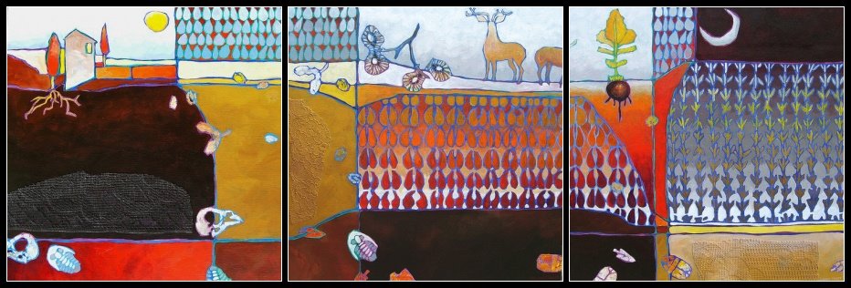
triptych

click for better image
I'm wrestling with what to do with this triptych. I think the third panel is the weakest and because of that, I may reduce it to a diptych. It's not large (each panel is 16" x 16"), and when displayed there will be a fair amount of space between each one. The third seems to be OK as a stand-alone. Six of one, half a dozen of the other...
posted by andrea at 10:54 a.m.
![]()
![]()
11 Comments:
Nooo, I don't think the 3rd is weak at all. In fact I think all 3 compliment each other perfectly. I went to Flickr and enlarged and its perfect. You've got the same colors spreading across all 3, I love how the first one has the sun, and the last is the moon. I really think they are great!
a.
I love them all. Ya know what, if you ever need a breather from your current banner--this would be great.
I have always been envious of your banner. All your work is so original and moving.
BTW...I think these are great as is, natch!
SMooch,
The Tart
Ps. I am now a Red Hot Lover with U, at the Unknown... Party!
Ooh, no - I like the third. Love the sliver moon and the wedge of orange. I held up my hand over it to see the other two as a diptych, but I like it like this. Very cool. Love the geometric pattern, the repetition, and I think the dark masses balance out nicely across the 3. The dark square in the upper right corner of the third balances the dark earth. Love the roots coming down!
Thanks for the input you three! I'm leaning towards leaving it as is now thanks to you. Now that I can see just the essential compositional elements by themselves, I'm beginning to agree that the third needs to remain. It was weird working on three paintings at once. I spent a lot of time just looking, trying to tie it all together. Usually I can't stop painting and get myself into the kind of trouble that necessitates the re-painting of areas but not this time -- though it took just as long with all the 'just looking' going on! At least I saved paint doing it this way...
this is great .. i love such disected designs (divided in three parts) .. great work
I'm not seeing what you are seeing, I think it looks amazing! Hope you don't mind my saying it's the shizzle!!!
Which one is the weak one? I think they all work really well together! They do also work well individually so you've done a brilliant job of making episodes that hang together on their own or as a group. Stunning!
I think they are great together, and I am ALL OVER that one in the middle. And you know what else I love? The painting in your banner! The first couple of times I saw it, I actually thought that the fish were crayons. DUH. But I love it!
I really like this one ! I find that leaving it as a triptych, creates more of a vast feel of a landscape.I love all the little seedlings in the Spring/third piece.
I love to read the interpretations! (e.g. Nabeel: dissected desings, Caroline: episodes, Sheri: seasons) You guys have NO idea how helpful and inspiring this all is for me. Val: the shizzle! I don't know what it means but I love it and Belinda: the banner is just a segment of a larger painting that I have cropped and photoshopped.
This is very unique. REminded me a bit of Klimt!
Post a Comment
<< Home