contained

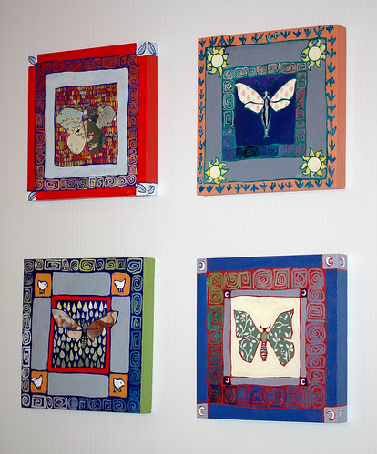
I've wanted to try this series of mini mixed media panels for awhile and finally got them out of my system this week. When Illustration Friday posted this week's theme today I was spurred to finish the last one, but unlike the first three, Moth4 (upper left) is is the only one not contained in a box. They were a major challenge technically as my remaining small paintbrushes have either two hairs each or resemble Tammy Faye Bakker's eyelashes. Thank God I'm meeting Ellen at Opus on Monday. I'm getting desperate!
The collage elements (wings) are wallpaper samples, an illustration of a Japanese print and Michelangelo's Libyan Sibyl. The rest is acrylic on cradled panel, primed with gesso. They are 6" x 6" x .75" each.

I started my Small Art shop blog in November then totally abandoned it when I got sidetracked by the season, but plan to post these over there sometime this weekend. Should they be available individually or as a set only?

18 Comments:
I kind of like them as a set.
I have four panels like that I've primed and planned to paint as the seasons, but never got around to doing them. Really hoping to focus on doing some actual art this year...
Lovely. I like the two on the left (2nd photo) particularly. Those backgrounds!
Cool set, and I ike that one pushs beyond the frame.
(The Tammy Faye image cracked me up.)
Hmmm...I'd say as a set, but you know what "the public" is like! Maybe don't offer a lower price as a set?
And I was right about the Japonais influence! (see Flickr comments)
they're beautiful A, but I would make them available individually, they don't each other althought they do look stunning as a set.
that was supposed to say they don't need each other! they stand alone wonderfully.
SEND MORE COFFEE
They are all great but my favourite is the one venturing outside the box. I think you should offer a choice to buy it as a set or individually.
Beautiful colors, Andrea! I would say make them available individually, since each is strong on its own. Someone might snap up all four anyway. Then again, someone might gravitate to one that "calls" to them, for an intimate wall space that is calling back.
I'd try selling them as a set to begin with and then if they don't go split them up.
Love the way you've mixed in collage and paint together.
These are great!I have an a beheMOTH (ha) book of natural history illustrations from the 18th Century I was just perusing the other day with lots of moth species, maybe I'll bring it. Looking forward to art shopping and java drinking with you.
Oh- I like the idea of a set, but individual might go better.
these are gorgeous!
These are really beautiful! I think offer them individually with a slightly lower price for all four together. They really look wonderful either way!
Really beautiful!
Happy New Year, Andrea.
Lovely shapes and colours!
Great photos below.
Missed your blog.
Thanks all. I have now posted them over on my Small Art site using your advice!
Wow! They look gorgeous on the wall :)
cabana digital
So pretty and unique. I especially love the red one.
Gorgeous series! Stunning together when presented. Nice job!
Post a Comment
<< Home