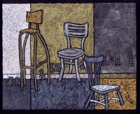
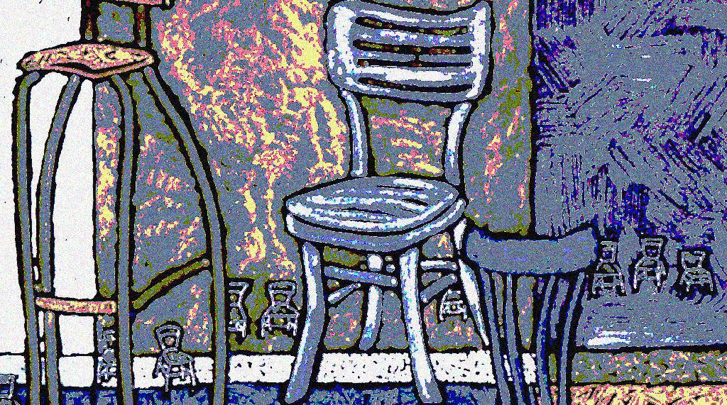
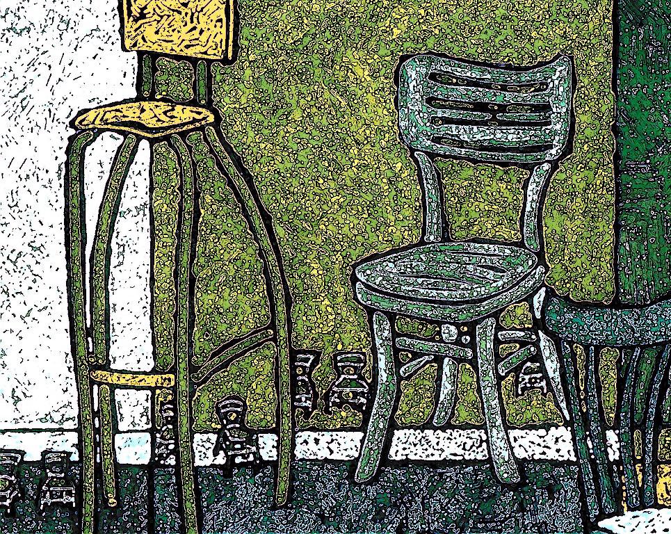
 I had no brilliant ideas for Illustration Friday this week, but I did want to do something new, resulting in this pretty unremarkable drawing, so after scanning it, I couldn't resist playing with it in Photoshop. First I tried a few effects with the format intact. Then I tried a variety of crops. In the end, I think I like the simplicity of the vertically-cropped monochromatic version best. It's all a process.

 Does anybody see a weird format here? i.e. the vertically cropped greyscale image overlapping the sidebar? If so, are you using Firefox and/or a Mac?
I think these look great...and now, seeing as I've made a comment...I would say that they are remarkable. :)
ReplyDeleteI like them all, although each one has a very different feeling. The vertical space suits the tall chairs well. I like that they seem to have a life of their own...as if they could just walk off theb "set."
ReplyDeleteI like them all too. Its great seeing how one picture can lead to so many versions - something I like doing too!!!
ReplyDeleteI especially like the little chairs as well as the big grown up ones - very funny!
Funny, you say unremarkable, I say fabulous!
ReplyDeleteYou've pushed Photoshop in really great ways here. Wonderful to see all the variations and crops. Great illustration. Very cool.
ReplyDeletefirst of all, your drawings are already beautiful as it is but trying something else with p have made them become also interesting and special.
ReplyDeletehello andrea...out of respect of your cool IF chair post, I have woven a story including you in my current post. i invite you to stop by and read about yourself!
ReplyDeleteplease leave a comment and let me know if there is more to my story...nifty chairs, i love the colors here...very soothing!
i'm really loving these chairs andrea! I love the green ones and the very top in your signature colours the most but all are wonderful and I love that when I look at your work I know it is Andrea Pratt.
ReplyDeleteThis is really great! Absolutely love all the colors. Modern art meets vintage art. Love it!
ReplyDeleteVery interesting and very beautiful design and color! :)
ReplyDeleteI really like the texture-and guttsy feel of these chairs,great color as well-so sharp
ReplyDeletePhotoshop can be so much fun sometimes!
ReplyDeleteYes and Yes on the weird format.
I've been waiting for you "Chair" pic, yeah. I like the black and white one the best. Nice work as usual andrea!
ReplyDelete~andrea
I like what you did with this drawing - all of the different styles. Yes, your layout does look very weird, and I'm using Firefox on a Mac.
ReplyDeleteChairs playing musical chair.... Fun! Like it!
ReplyDeleteMusical chairs! what a great idea. these are all wonderful. great design and composition.
ReplyDeleteI'm using safari and mac and yes your pic is into the side bar
I need new chairs for Casa! Keep on producing, Andrea!
ReplyDeleteAndrea - I was going to mention that the layout is really weird on my computer. I'm viewing it in Safari on a Mac, and the greyscale illo is way over to the right and underneath your blogroll. Did you line them up in a vertical row, or try to postion them across?
ReplyDeletewow they are all incredible. the textures on the last grayscale one are very nice.
ReplyDeleteHAHAHA it amazes me when you say unremarkable drawing! I wish i could do that!
ReplyDeleteThe subject calls for a vertical compostion and love the last one. The first I prefer mood wise. They are all great!
ReplyDeleteI use a Mac and Safari and the alignment is out-of-whack...that's the negative, the positive is these are really great.
ReplyDeleteLove them all love.
ReplyDeletelove
I'm using Firefox and I see one image overlapping. But all the versions of your work look great. I kind of like most the uncropped PS version, because I love the yellow chair's daddy long legs and the BG colours. Adorable yet a little creepy little chairs running around. I also like your original. All are good !
ReplyDeleteI love all the little chairs line-dancing in the background.
ReplyDeleteThanks for the fantastic feedback mes amis. I am trying to fix the one image so that it aligns properly for those viewing it with a less common browser but Blogger is !@!?*#!? acting up again. I'll try again later and then you can let me know if there's an improvement.
ReplyDeleteOK -- I made the change. Any better?
ReplyDeletebeautiful series!! Love how you can come up with so many great paintings on a simple everyday item!
ReplyDeletewow.. great concept! i didnt notice the baby chairs until i scrolled downwards.. nicely put patterns.. and even the b/w is gorgeous!
ReplyDeleteHmmmm, chairs for inspiration? You artistes are just out there...I have a friend in San Francisco who specializes in painting giant fruit. He sells a lot of his work to restauranteurs. Has a big commercial business. Must be fun to make art out of every day objects. We've been accused of having too many chairs in our apartment. LOL!
ReplyDeleteVery funky! I really like the textures here.
ReplyDelete